Designing a Website That Works
How I designed a complete website through user flows, journeys, and intentional UX decisions.
2025
UX/UI Design
Wireframing
Brand Design
Freelance
context
📑
I was brought on by Airdog to design their website from the ground up as they expanded from an established presence in Asia into the North American market. Working from an existing brand and style guide, I partnered with a freelance marketing director and an in-house marketer to translate strategy into a clear, conversion-focused digital experience.
Over a three-month build, I designed 50+ mobile and desktop screens, defining the site’s structure, flows, and visual system. The result? A cohesive, scalable website that was fully adopted by the company—and is still in use today. Not bad for a blank canvas 😎.
💥
Challenges
The biggest challenge wasn’t the design, it was collaboration. Three strong-willed collaborators, all new to working together, each brought different goals, tastes, and opinions to the table. Navigating that meant grounding our communication in inspiration, research, and clear usable design options, even when final decisions ultimately sat with the client.
A second challenge was advocating for solid UX practices and framing them in a way beyond “because it’s best practice.” By consistently tying decisions back to usability and user needs, we found common ground that cut through personal preference and kept the project moving forward. In the end, usability became the shared language that got us across the finish line.
🔍
Research
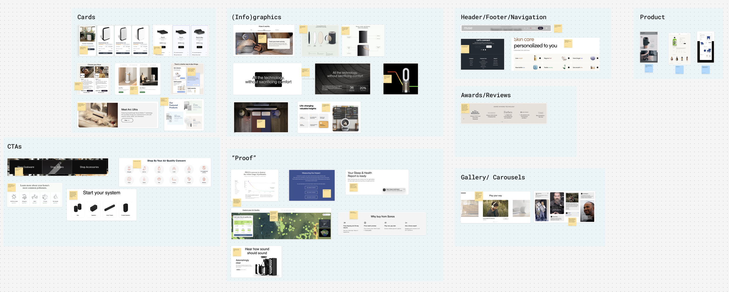
The project kicked off with a competitor analysis and a deep dive into brands that were already doing it well (and a few that definitely weren’t). Using the brands outlined in the brief, I broke down what worked, what didn’t, and why they did or didn’t by looking closely at individual components, layouts, and patterns rather than surface-level aesthetics.
From there, we collaboratively selected the elements worth emulating and the ones best left behind. That foundation set the direction for design and fueled an iterative process focused on building something informed, intentional, and distinctly Airdog’s own.
✍️
Design & Iteration
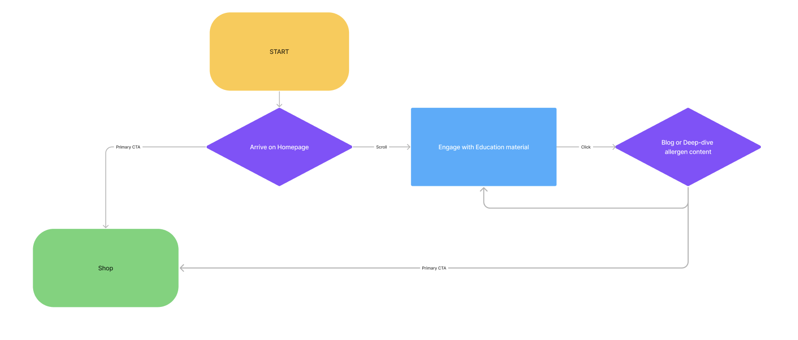
User Journey
The brief was refreshingly simple: guide users to purchase in as few clicks as possible. That directive shaped a deliberately streamlined user journey, optimized for clarity and momentum.
At the same time, the team had the larger ambition to position Airdog as a trusted hub for product-relevant science and education. The challenge was balancing speed with substance. We solved for both by weaving educational content into the flow, giving curious users a reason to dig deeper while keeping the path to purchase free from friction. In other words, let the science do the talking, without causing delays to the original goal of pushing to purchase.
Low fidelity design
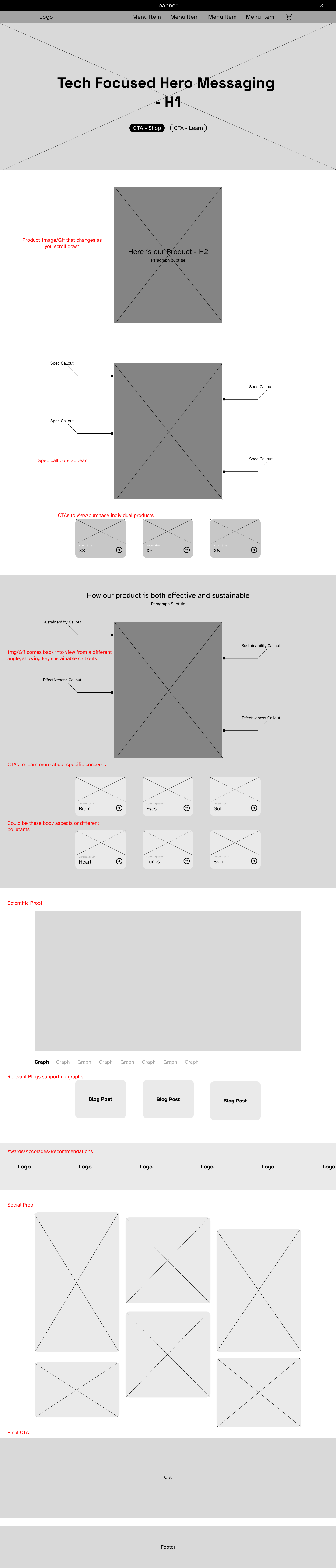
Before we could decide what the site should look like, we had to agree on how it should work. Early on, it became clear that jumping into visual design without a shared structure would only multiply opinions later.
So we stepped back and I sketched several low-fidelity layout options, using them as conversation starters rather than commitments. Each version helped surface what mattered, what didn’t, and where the content actually wanted to live.
Eventually, one format proved strong enough to carry the homepage. That decision quietly did a lot of heavy lifting and set the foundation not just for the user interface, but for the overall user experience.

Additional Guide Elements
Once the direction was set, the real production work began. I designed 50+ high fidelity screens for Airdog, serving as the blueprint not just for the client, but for the web developer bringing the site to life. Each page was designed in both desktop and mobile formats, with a deliberate emphasis on desktop, catering to a target audience that values clarity and familiarity over novelty.
As the screen count grew, consistency became the challenge. Every card, especially product-driven ones, needed to be immediately legible, accessible, and unmistakably clickable. The aforementioned goal was simple: guide users to purchase in as few clicks as possible. These cards were designed with no guessing, no hesitation, no “what happens if I click this?” in mind.
Color added another layer of complexity. The client was unwavering in their vision of a site that celebrated color. They wanted to use it not just decoratively, but as a navigational cue to connect users with specific products. My task was to honor that ambition without sacrificing usability. Working from their existing brand and color guidelines, I expanded the palette with darker, higher-contrast tones where needed, ensuring interactive elements remained accessible while still delivering the bold, energetic experience they wanted.


🤔
Final Thoughts
In the end, the project was equal parts challenging and rewarding. Building a design language from the ground up required constant problem-solving, thoughtful tradeoffs, and the occasional pushback, but it was also genuinely fun. Every decision was anchored in the client’s brief and ambitions, translating their vision into a system that was both expressive and usable. The real win, though, is longevity: the design system created for this project is still in use today, continuing to guide new pages and proving it was built to last, not just to launch.