
From Chaos to Consistency
Building a comprehensive UI guide from scratch to bring clarity and consistency to product design
2025
UX/UI Design
Redlining
Prototyping
Wireframing
context
📑
When I joined the company, there was no UI guide. There was no shared standard for designing concepts, building prototypes, or implementing design across the four distinct web properties the company owned and operated. Each product had evolved independently, and design decisions varied from one experience to the next. This lack of guide made it difficult to maintain consistency.
To make sense of the problem at hand, I presented my idea to create a guide to my manager and began by auditing the UI elements across our four web properties. What started as a collection of mismatched design elements became an opportunity. By synthesizing what worked and identifying gaps, I created a cohesive UI guide that brought clarity, consistency, and a unified foundation for the design process.
💥
Challenges
The real challenge wasn’t the UI itself, rather it was the fact that four separate web properties existed, and each functions with a different purpose and a team with strong opinions about how things should work. Unifying the UI became less of an exercise of consistent design and more an exercise in communication, and dare I say, persuasion.
As the guide began to take shape, a shift in leadership and business direction changed the project’s trajectory. While the work sparked ongoing conversations and alignment across teams, full adoption stalled. The guide I created remains a living reference point: ready, although not yet fully realized.
🔍
Research
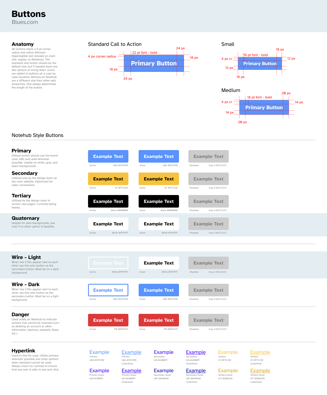
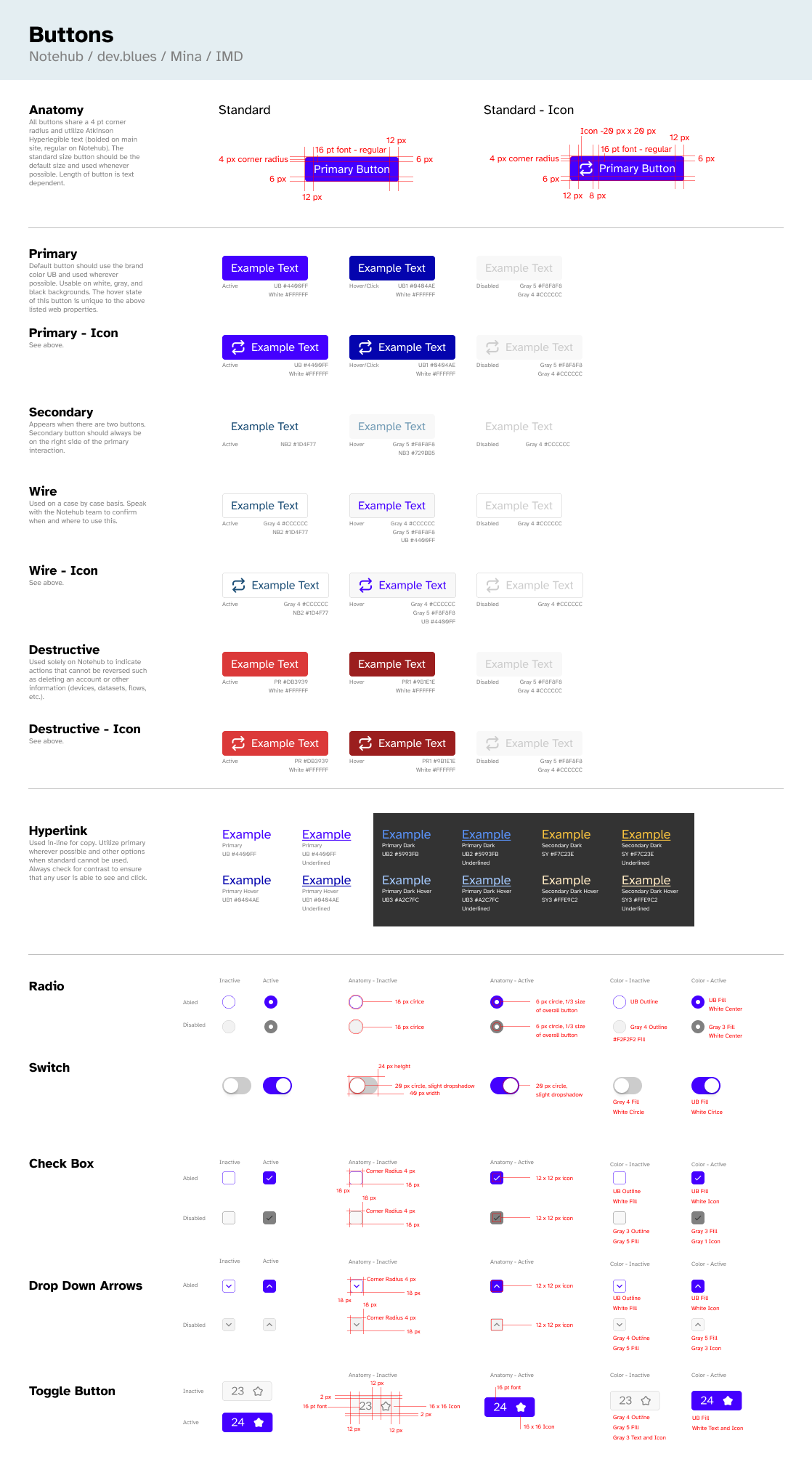
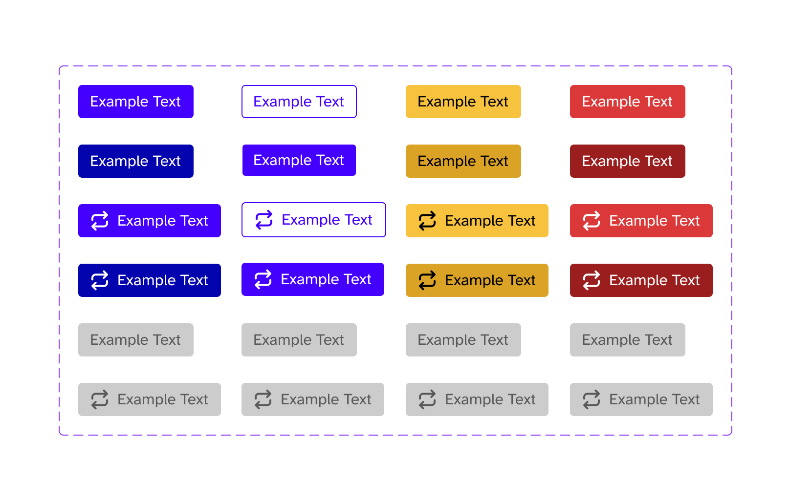
I began with the most fundamental UI element: the button. What I found was a surprising amount of variation. Multiple styles, text applications, colors, and behaviors, with no documented rationale behind them. These inconsistencies became clear evidence of the larger problem, and they provided the leverage I needed to start building. Using the button as a foundation, I built a robust UI guide that established clear rules and intent around one of the most essential UI elements.


✍️
Design
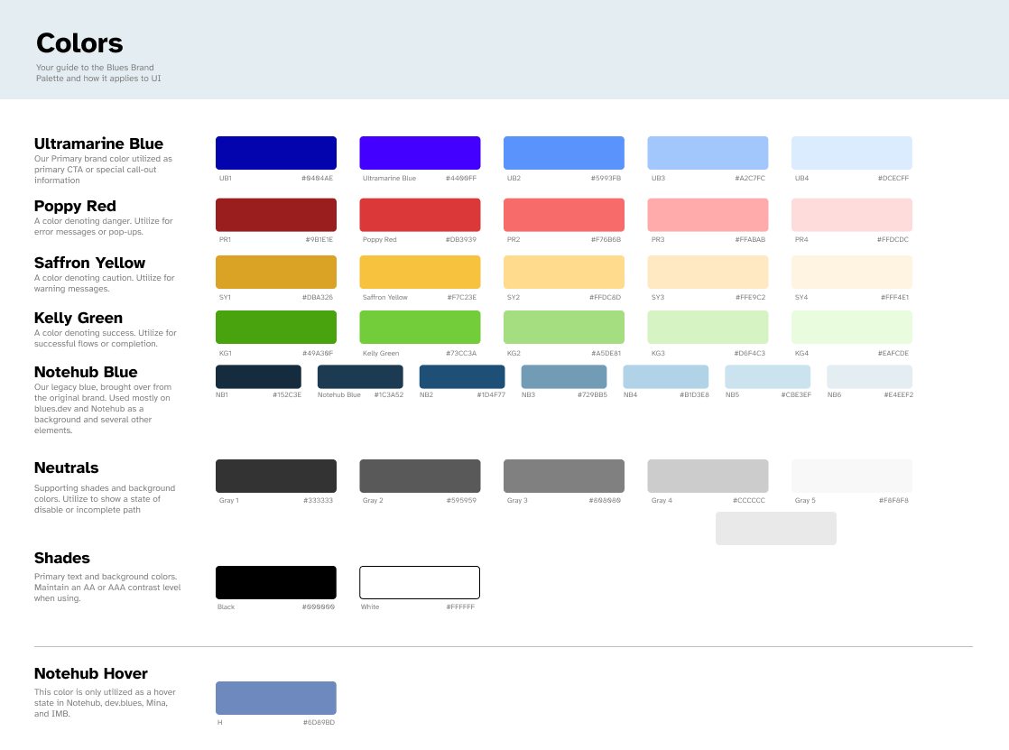
Color Guide
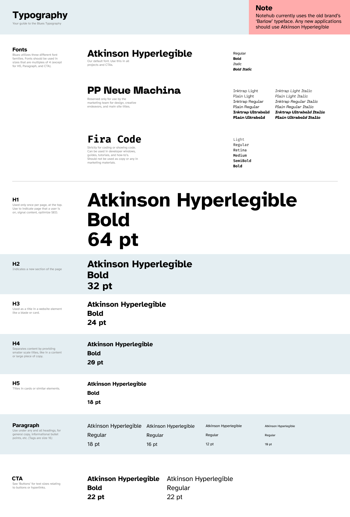
I built the guide in Figma, intentionally treating it as a living document, designed to evolve over time and be updated by more than just me (a radical concept, I know 😆). From there, I established a clear set of brand colors, grounding each one in meaning my manager and I had already aligned on. It was a small, but deliberate first step, setting the tone for a guide built on clarity, intention, and understanding.
Button Guide
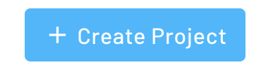
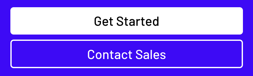
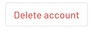
Starting with the the aforementioned button, I built out the most critical section of the guide. I began by documenting how buttons already appeared across the various products, then iterated deliberately toward what we wanted them to be. Throughout the process, I tested accessibility requirements and worked closely with the team to make informed decisions, ultimately landing on a darker blue as our primary button style.
From there, I mapped out the many places buttons showed up across the site and defined clear rules for each use case. Because buttons were the highest priority in the brief from my manager, this section received the most attention. I spent a considerable amount of time spent documenting patterns, redlining designs, and defining reusable instances to ensure consistency moving forward.
To ensure this, I built the button out using components and instances, to help anyone who might have a hand in wireframing and prototypes to easily be able to pull in the button without having to think about it.
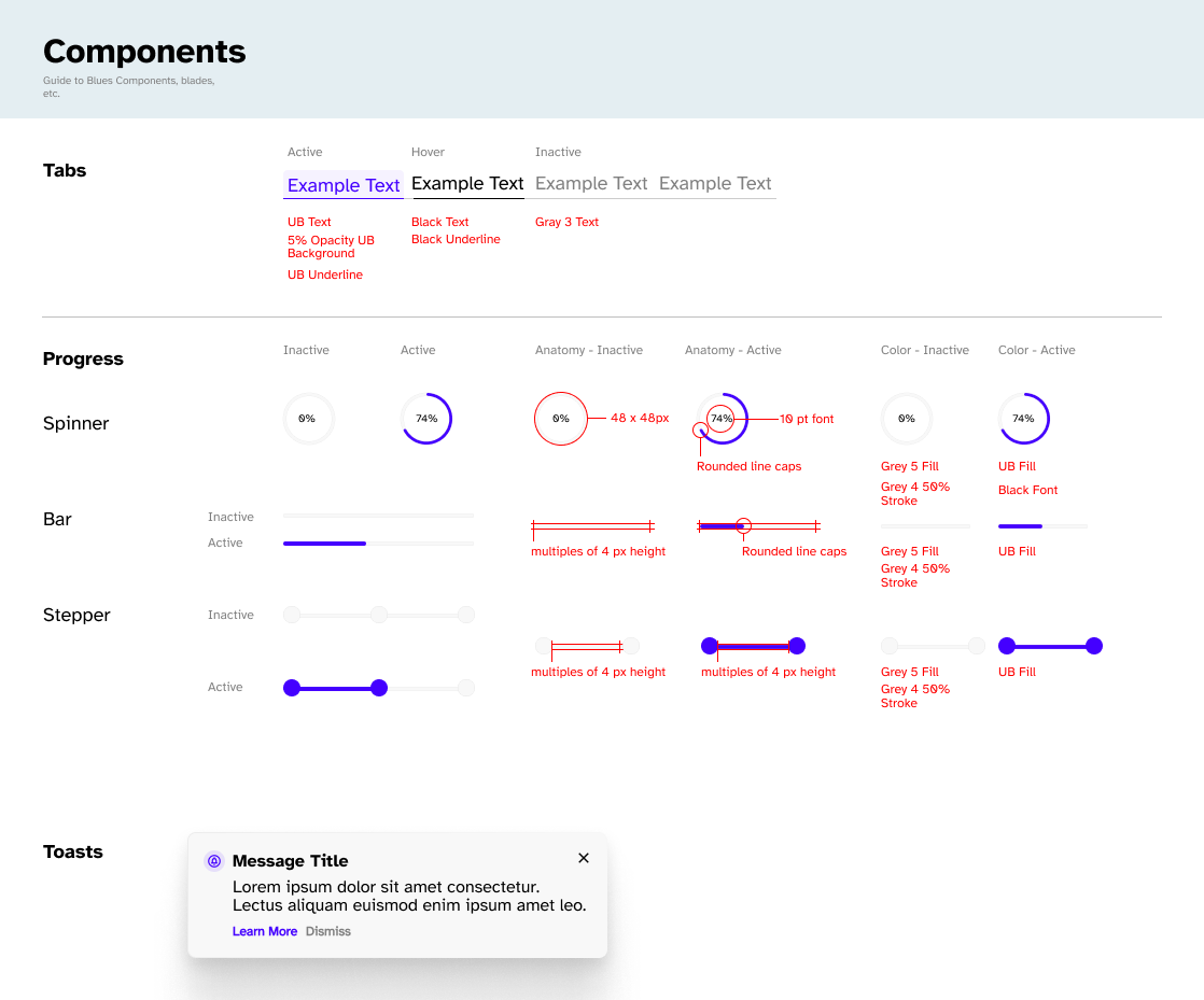
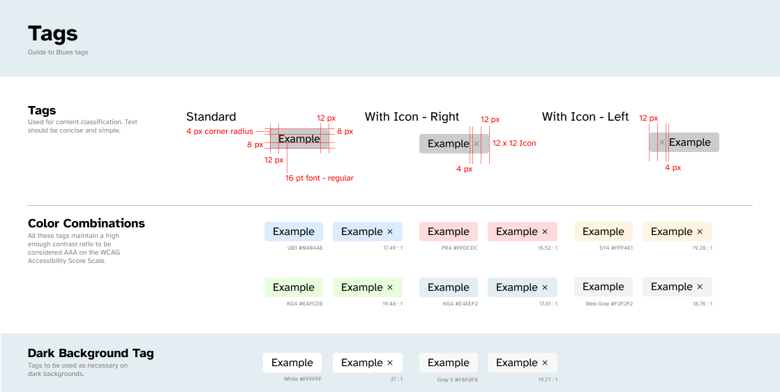
Additional Guide Elements
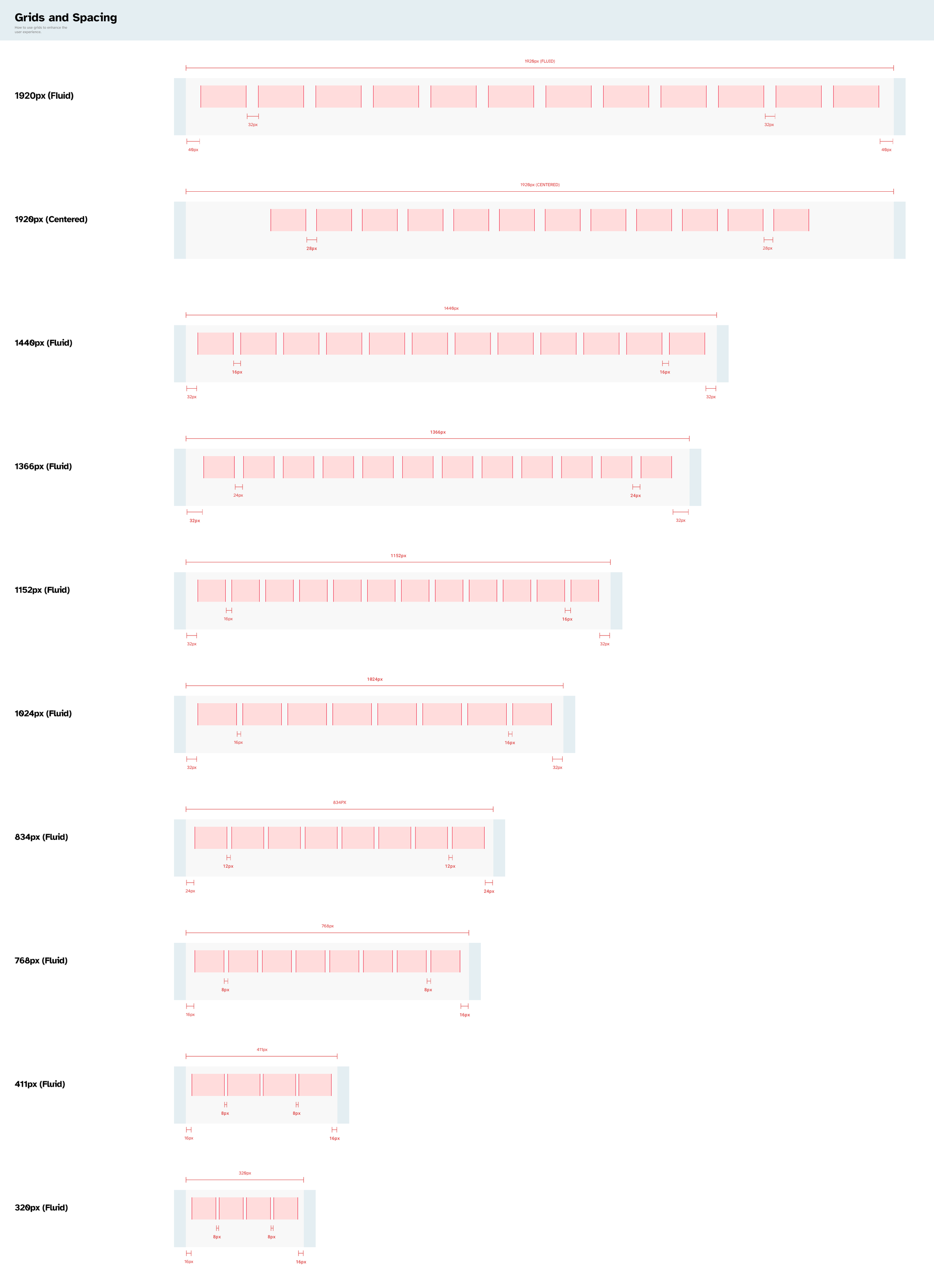
With the most critical piece in place, I shifted focus to the rest of the system. I defined spacing rules, the typography stack, and began work on a growing library of shared components. Piece by piece, the guide expanded beyond individual elements into a set of principles that provided guidance on how the site should feel and function. By documenting these decisions, I was able to capture a substantial portion of the current design language and help establish a more consistent, repeatable design process across the company.
🤔
Final Thoughts
This project was genuinely enjoyable for me. I love getting into the nitty-gritty of a project: redlining components, detail-oriented decisions, and turning fuzzy ideas into clearly documented systems. Building this guide reinforced how much I enjoy the intersection of detail and design, where thoughtful constraints make better design possible. Even though the guide isn’t fully realized yet, the process itself was a reminder of the kind of work I find most rewarding: creating clarity where there was none.