Clarity over complexity
Redesigning site navigation to reduce friction and guide users to their goal faster
2025
UX/UI Design
User Research
Web Navigation
Information Architecture
context
📑
The existing website navigation made it difficult for users to discover key pages, forcing them into unnecessary clicks, longer journeys, and limiting their sense of choice.
Given this, my goal was to simplify the navigation while increasing discoverability, offering clearer pathways, and reducing clicks without fatiguing users. By adopting a user research approach, the task expanded to restructure the navigation to reflect what people were actually searching for and how they were searching for it.
Upon further reflection of the statistics and information at hand, I incorporated additional goals to create a reduction in bounce-rate, surface high-value content, and create a more intuitive site experience.
💥
Challenges
The primary challenge of this project was coordinating communication across four separate teams: Marketing, Operations, Developer Experience, and Leadership. This required careful, considerate, and intentional collaboration. Opening the design up for scrutiny across many aspects of the business, but ultimately, this wound up being the correct course of action. Each team had different insights into what our users needed, and what we could do to help them along their journey.
🔍
Research
I started by taking an inventory of what we already had. Utilizing data retrieved from HotJar I began to notice a trend: Users were using out navigation, and it seemed like the majority as well. But questions began to arise as I dove deeper into the data. If users were utilizing our navigation and getting to their desired information, why were so many dropping off so soon after reaching it? Why is the bounce rate so high? With these questions in mind, I decided to analyze the other data at my disposal.
With Google Analytics, I pulled statistics on our top performing pages and seeing which were accessible from the navigation (spoiler it was less than 20% 😰.) I gathered additional information about what kinds of devices our users were using, and again the data started to raise questions. If most of our users come to our site on a mobile device, what is causing the bounce rate to be greater on mobile than on desktop? Why have we not taken a mobile-first approach to the design of our navigation?
At first glance, my research netted more questions than answers. The path to answers came through in the realization that improving the flow and design of the navigation will help the user, and give insight to these data points. It was time to move on to design and iteration.


✍️
Design & Iteration
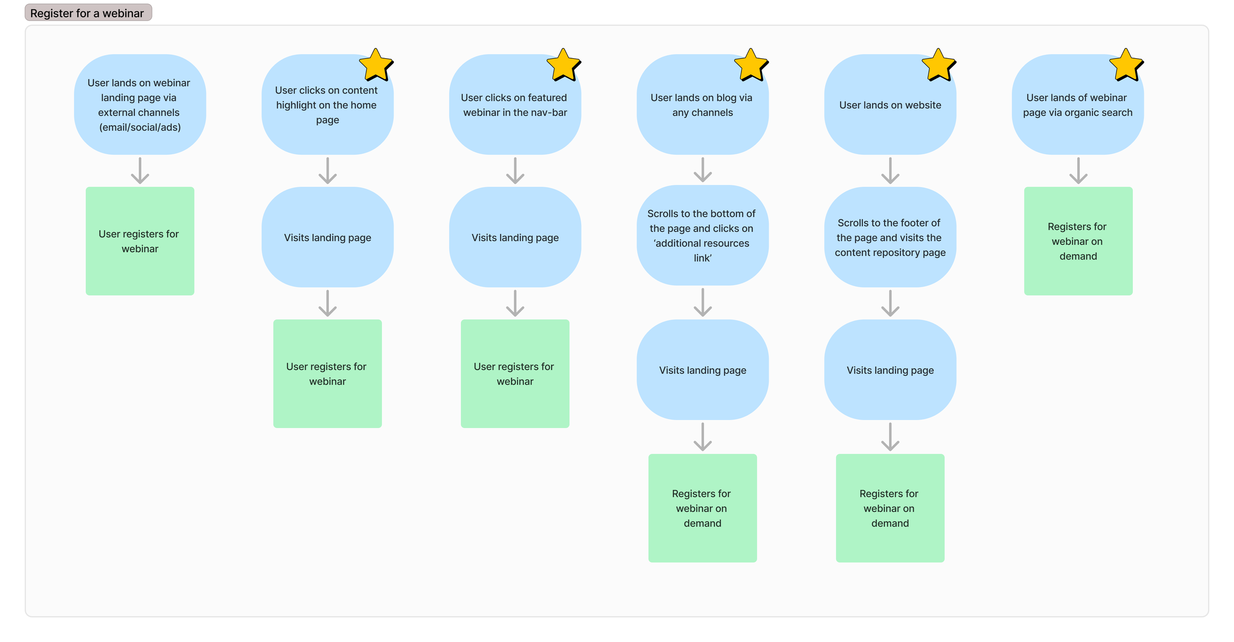
User journey and low fidelity information architecture
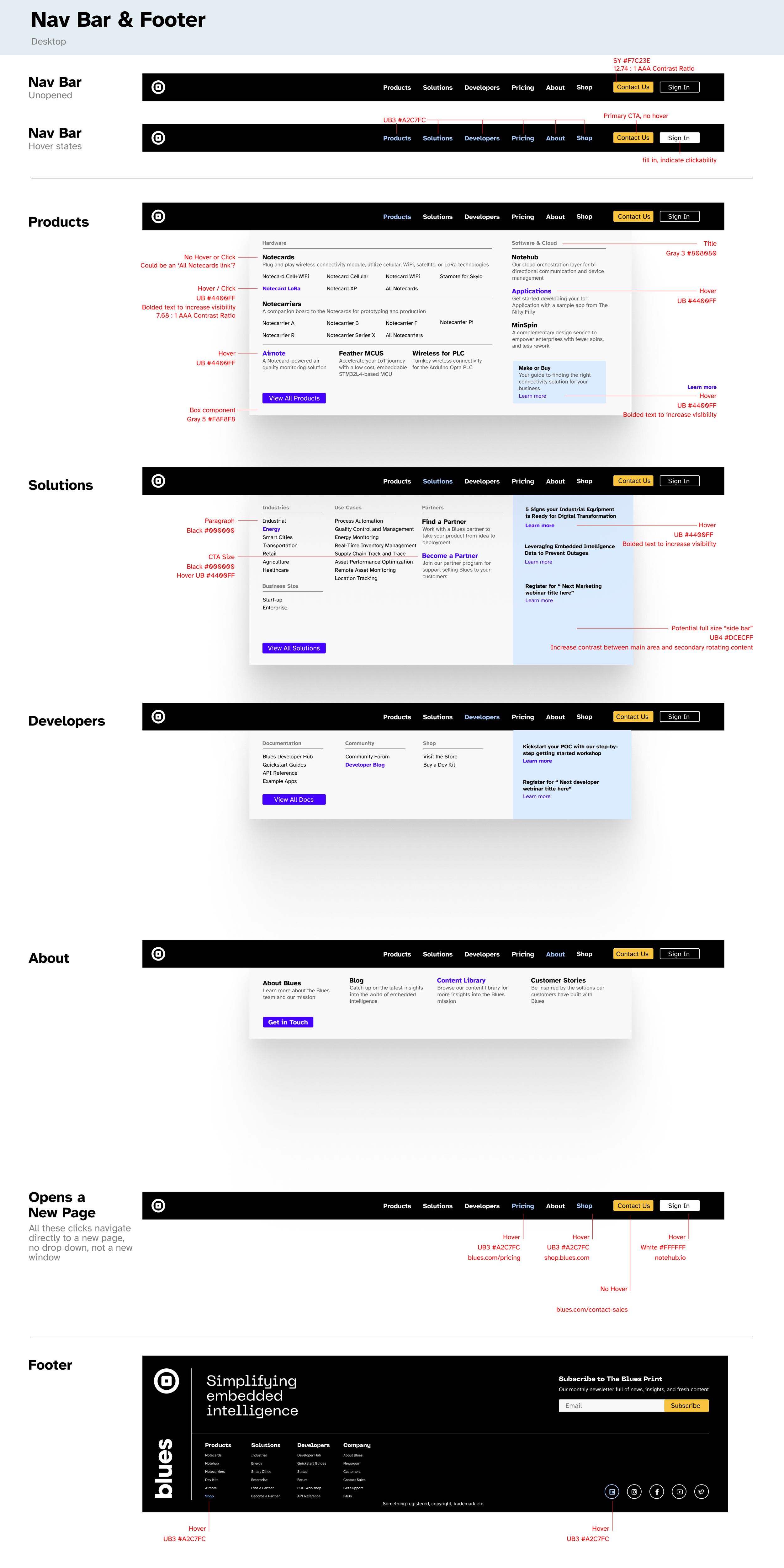
After gathering inspiration from various sites I thought had great navigations, I took my ideas to Figma. I started by determining the missing pieces needed in the navigation and creating an ideal user journey. After determining this was the correct course of action, based on the stakeholder needs, I moved on to higher fidelity design concepts.
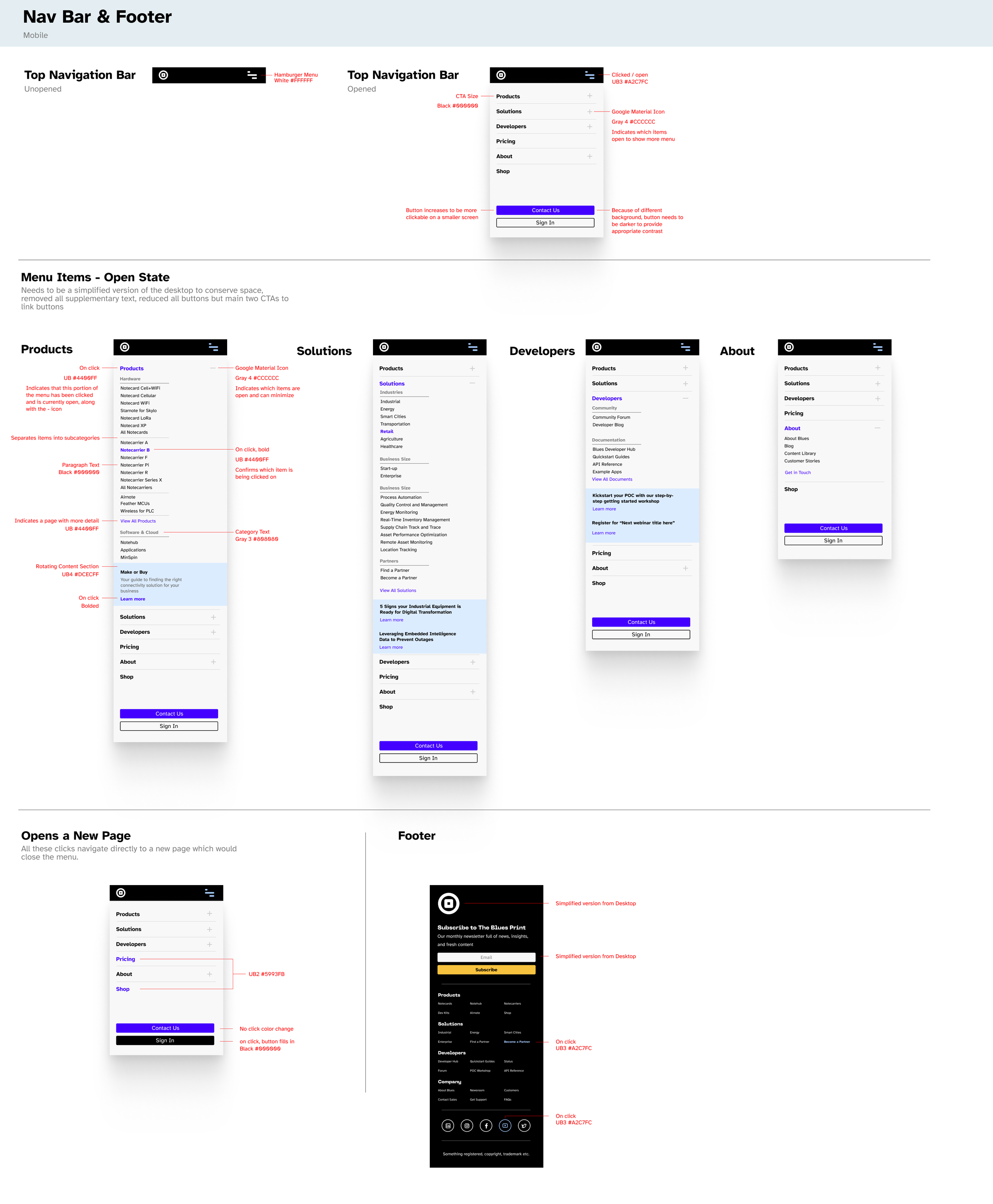
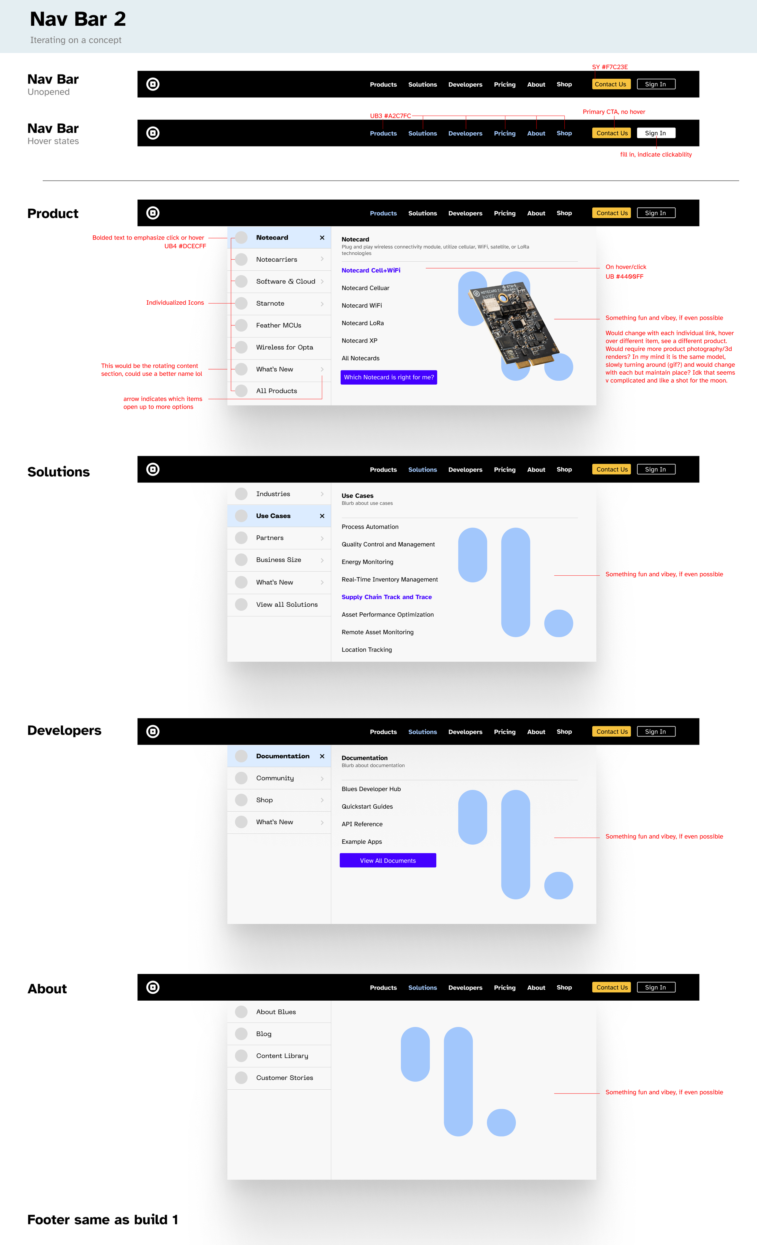
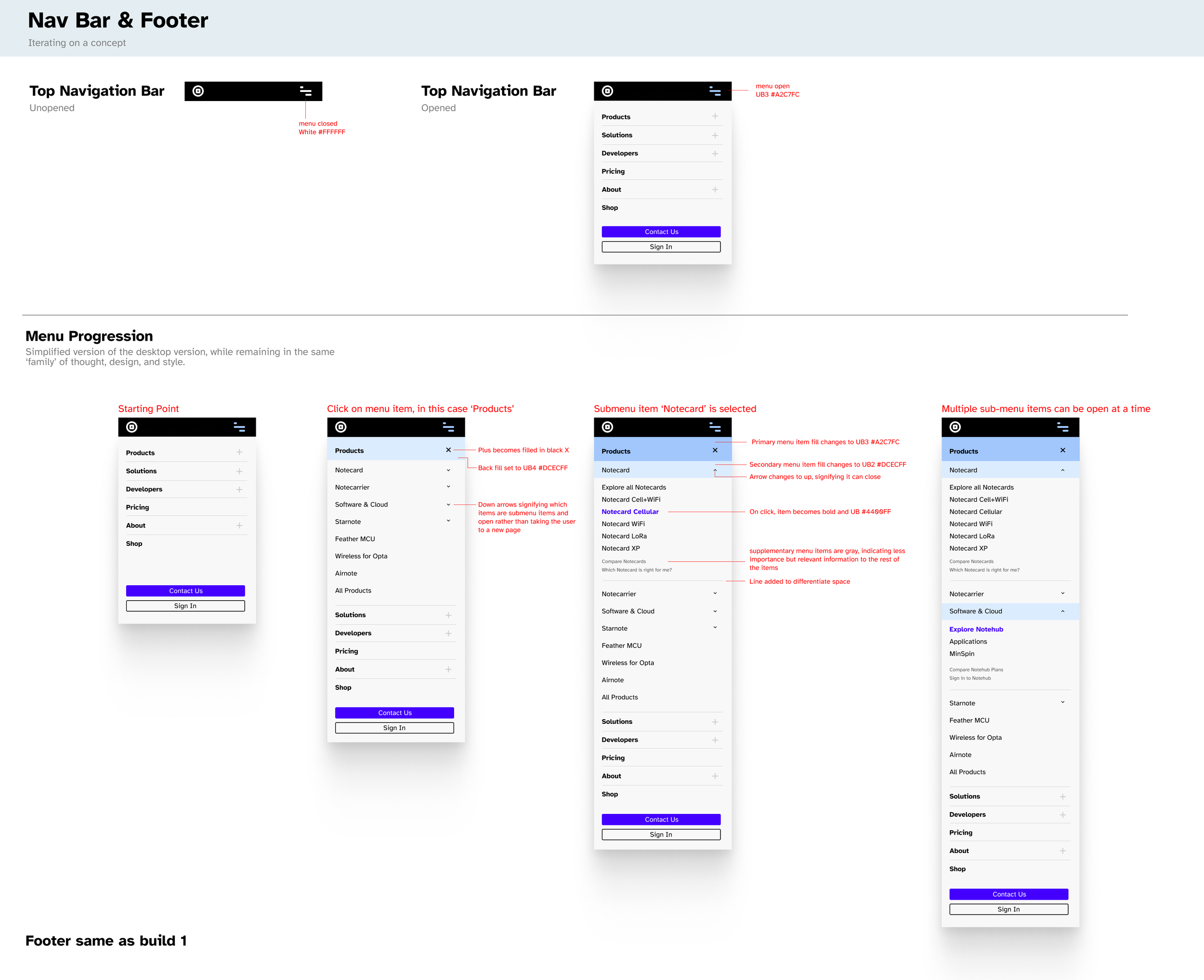
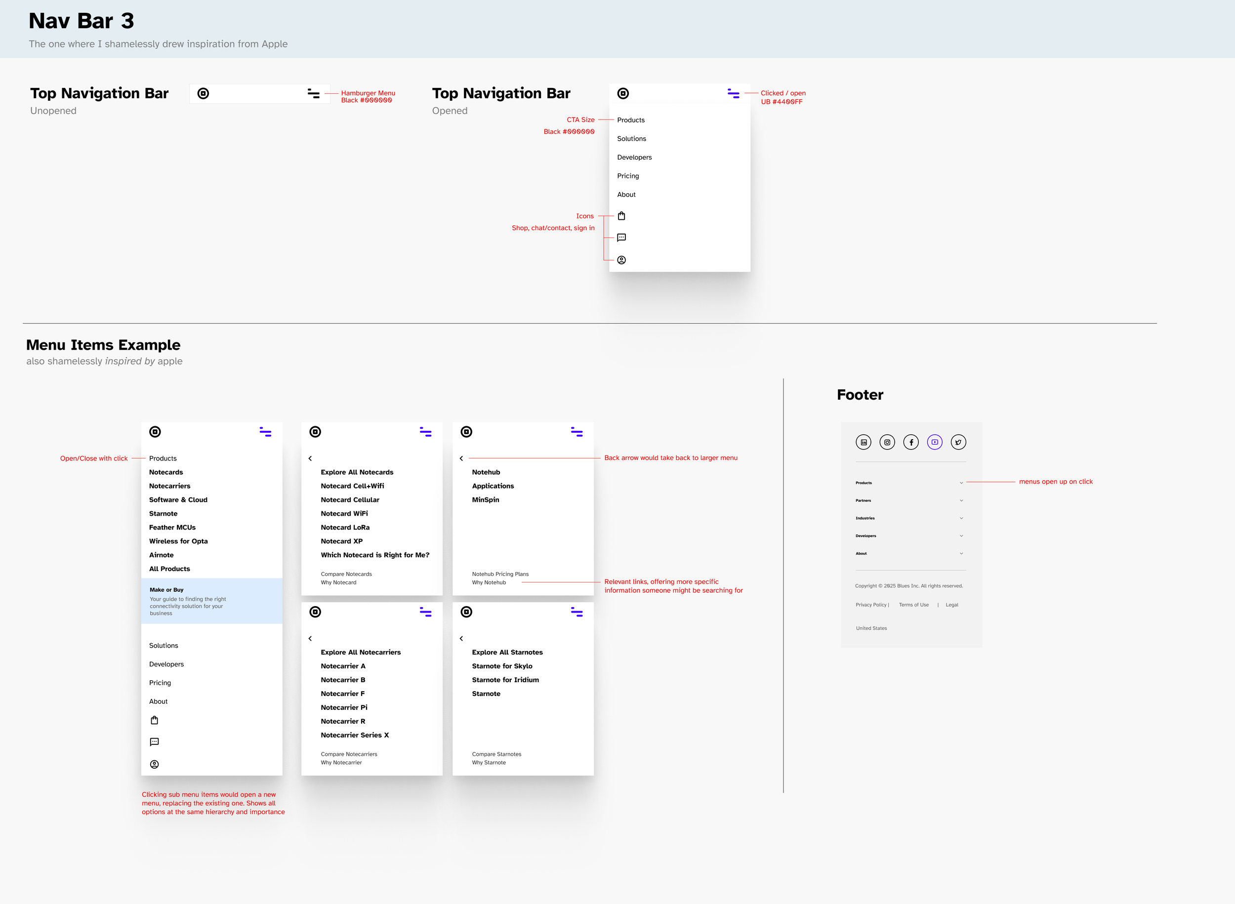
High fidelity design - mobile
Utilizing the information architecture settled on by the low fidelity mockups, I began with the mobile version of the menu. I was careful to label things while designing to make sure that anyone reviewing the design could understand it. I created three potential versions, as long as matching desktop versions and submitted the products for review. I iterated based on feedback received from my team as well as our developer team, and we moved forward with the initial design.
🤔
Final Thoughts
Overall, I really enjoyed this project. Unlike many day-to-day efforts that are driven by assumptions about our user needs, this project was backed by research and cross-team collaboration, centering my design in confidence rather than guesswork.